| .NET assembly (binary) | Download MultiDropDown-v2_bin.zip - 11.22 KB
|
| Source code | Download MultiDropDown-v2_src.zip - 15.15 KB
|
| Demo | Download MultiDropDown-v2_demo.zip - 22.88 KB
|
Introduction
The stock DropDown control that comes with ASP.NET allows us to select only one item. To overcome this limitation, I wrote the MultiDropDown ASP.NET Server Control that allows selection of multiple items from a checkable list of items. This control supports multiple instances in the same web page. The best part about this control is you do not have to add any other external files (like images, style sheets or JavaScript files) to your project, the control does everything automatically behind the scenes.
Features
- Supports multiple instances on the same page.
- Appearance of textbox, button, dropdown and tooltip can be customized.
- No external files like JavaScript or style sheets required. The control take care of everything.
- ASP.NET AJAX compliant. Works with UpdatePanel.
- Uses plain JavaScript. No JavaScript framework (like jQuery, mootools, etc.) required.
- Works with Internet Explorer, Firefox, Chrome, Opera and Safari. (Safari and Chrome do not seem to honor the dropdown's
min-widthproperty though). - Just drag-n-drop to your page and start using the control.
- Allows searching items.
Background
I had been looking for a control that allows me to select multiple items from a drop down, after searching the Internet in vain to find one, I decided to write my own ASP.NET server control that allows selection of multiple items. The result? the MultiDropDowncontrol.
Using the MultiDropdown Control
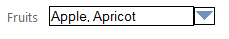
The control consists of a textbox, an image button and a dropdown. The default appearance of the control is:
Clicking on the textbox or on the image button brings up the dropdown area.
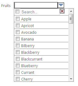
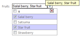
When items are selected, the textbox is automatically updated to show the comma separated list of the selected items. The selected rows are also highlighted. You can select items by clicking anywhere on the item and not just the checkbox. You can also click the 'All' item to select/unselect all items in the dropdown. The control also has a built-in tooltip that automatically shows the selected items.
As you start typing in the Search box, the list is filtered to match all the items that start with the characters you type. Clicking on the Clear Search button clears the filter and display all items.
<%@ Register Assembly="MultiDropDown" Namespace="MultiDropDownLib" TagPrefix="MultiDropDownLib" %>And the control instance looks like this:
<MultiDrodownLib:MultiDrodown ID="MultiDropdown1" runat="server"/> To add items to the control's dropdown, set its DataSource, DataTextField and DataValueField properties.
DataTable dt1 = new DataTable(); dt1.Columns.Add(new DataColumn("Name", typeof(System.String))); dt1.Columns.Add(new DataColumn("ID", typeof(System.String))); dt1.Rows.Add(new string[] { "Apple" ,"1" }); dt1.Rows.Add(new string[] { "Orange" ,"2" }); dt1.Rows.Add(new string[] { "Pear" ,"3" }); dt1.Rows.Add(new string[] { "Banana" ,"4" }); dt1.Rows.Add(new string[] { "Grapes" ,"5" }); dt1.Rows.Add(new string[] { "Strawberry","6" }); MultiDropDown1.DataSource = dt1; MultiDropdown1.DataTextField = "Name"; MultiDropdown1.DataValueField = "ID"; To get the list of selected items and selected values, use the SelectedItems, SelectedValues properties. TheSelectedItems property is comma separated and the SelectedValues property is pipe separated.
string selectedItems = MultiDropdown1.SelectedItems; string selectedValues = MultiDropdown1.SelectedValues; Customizing the MultiDropDown Control
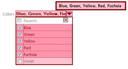
Almost every aspect of the control can be customized. Here's an instance of a customized control.
<MultiDropDownLib:MultiDropDown ID="MultiDropDown2" runat="server" DropdownOnMouseOver="true" DropdownOnFocus="true" TextBoxClass="textbox1" ImageButtonClass="imagebutton1" TooltipClass="tooltip1" DropdownClass="dropdown1" /> To show the dropdown just by hovering the mouse over the textbox, set the DropdownOnMouseOver property to true. This is turned off by default to avoid unnecessary intrusion of the dropdown on the page. The DropDownOnFocus property determines if the dropdown is shown when the textbox receives focus. This property is true by default.
The textbox can be customized by setting the TextBoxClass property to a custom CSS class.
.textbox1 { border: 1px solid maroon; background-color:#FFC2D0; color:maroon; font-weight:bold; } The button can be customized by setting the ImageButtonClass property to a custom CSS class in your web project. The image is rendered as a div element to enable images to be set with a CSS class. (The image element does not allow images to be set with a CSS class.) To change the image to a custom image, set the background-image property in your CSS class to the path of the desired image file path. Be sure to set the height and width properties also..imagebutton1 { display:block; background-image:url(../images/multidropdown.png); background-position:bottom; background-repeat:no-repeat; height:18px; width:21px; } The dropdown can be customized by setting the DropdownClass property to a custom CSS class. However when declaring a CSS class for the dropdown you have to declare separate classes for the td as well, like this:
.dropdown1 { border: 2px solid maroon; min-width:150px; } .dropdown1 td { border: 1px dotted maroon; background-color:#FFC2D0; } The tooltip's appearance can be customized by setting the TooltipClass property to a custom CSS class.
.tooltip1 { position:absolute; display:block; padding:2px 12px 3px 7px; margin-left:5px; background:#FFC2D0; color:#222222; border:4px solid maroon; font-weight:bold; } Here's an example of a customized MultiDropDown control:
Exploring the Source Code
The control is developed using Visual Studio 2010/.NET Framework 4.0. However, with little tweak it can be made to work with older versions of .NET. The project structure is like this:
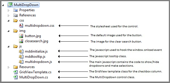
The MultiDropDown.cs file contains the ASP.NET Server Control and it inherits fromSystem.Web.UI.WebControls.WebControl. It also implements the marker interface System.Web.UI.INamingContainerto ensure that the ASP.NET runtime assigns unique names to the child controls based on the MultiDropDown Control's Id. This helps us to write code in such a way that multiple instances of the control can be placed in the same ASP.NET Page. The control consists of a Html Textbox (HtmlInputText), an Html image (HtmlImage), a div element for the dropdown area (HtmlGenericControl) and an ASP.NET GridView control for the dropdown items and an Html table (HtmlTable with associated HtmlTableRow and HtmlTableCell objects) to arrange the child controls. I decided to use the GridView control instead of an Html table to ease databinding.
The child controls are composed inside the control's class, this automatically takes care of the child control's ViewState. The child controls are initialized in the overriden OnInit() method. The CreateChildControls() method is overriden to add the child controls to the server control's Controls collection and to do the actual databinding. The OnPreRender() method is overriden to inject the link tag for the stylesheet.
The JavaScript files, the Stylesheet and the default button images are embedded inside the control assembly as WebResources. This enables the control to serve embedded resources as resources over the web. You may wish to search Code Project to learn how to use WebResources. I'll explain how the main JavaScript file is rendered as a
No comments:
Post a Comment